Keller’s Auto Sales website struggled with poor navigation, unclear vehicle details, and limited financing transparency, making it difficult for users to browse inventory, access financing options, and connect with customer support. To address these issues, we redesigned the website’s information architecture to create a more intuitive structure, ensuring seamless navigation. We also revamped key pages, including the homepage, inventory page, finance page, and about us page, to improve usability, enhance vehicle listings with detailed condition reports, and provide clearer financing options. The redesign aims to offer a streamlined and engaging online experience, empowering users to easily find, evaluate, and finance their ideal used car.
Keller’s Auto Sales website struggled with poor navigation, unclear vehicle details, and limited financing transparency, making it difficult for users to browse inventory, access financing options, and connect with customer support. To address these issues, we redesigned the website’s information architecture to create a more intuitive structure, ensuring seamless navigation. We also revamped key pages, including the homepage, inventory page, finance page, and about us page, to improve usability, enhance vehicle listings with detailed condition reports, and provide clearer financing options. The redesign aims to offer a streamlined and engaging online experience, empowering users to easily find, evaluate, and finance their ideal used car.
Keller’s Auto Sales website struggled with poor navigation, unclear vehicle details, and limited financing transparency, making it difficult for users to browse inventory, access financing options, and connect with customer support. To address these issues, we redesigned the website’s information architecture to create a more intuitive structure, ensuring seamless navigation. We also revamped key pages, including the homepage, inventory page, finance page, and about us page, to improve usability, enhance vehicle listings with detailed condition reports, and provide clearer financing options. The redesign aims to offer a streamlined and engaging online experience, empowering users to easily find, evaluate, and finance their ideal used car.
Keller’s Auto Sales website struggled with poor navigation, unclear vehicle details, and limited financing transparency, making it difficult for users to browse inventory, access financing options, and connect with customer support. To address these issues, we redesigned the website’s information architecture to create a more intuitive structure, ensuring seamless navigation. We also revamped key pages, including the homepage, inventory page, finance page, and about us page, to improve usability, enhance vehicle listings with detailed condition reports, and provide clearer financing options. The redesign aims to offer a streamlined and engaging online experience, empowering users to easily find, evaluate, and finance their ideal used car.
Keller’s Auto Sales website struggled with poor navigation, unclear vehicle details, and limited financing transparency, making it difficult for users to browse inventory, access financing options, and connect with customer support. To address these issues, we redesigned the website’s information architecture to create a more intuitive structure, ensuring seamless navigation. We also revamped key pages, including the homepage, inventory page, finance page, and about us page, to improve usability, enhance vehicle listings with detailed condition reports, and provide clearer financing options. The redesign aims to offer a streamlined and engaging online experience, empowering users to easily find, evaluate, and finance their ideal used car.
Background
Background
Background
Background
Background
Keller’s Auto Sales is a used car dealership based in Savannah, catering to customers looking for reliable, well-priced vehicles. Committed to customer satisfaction, Keller’s Auto Sales provides competitive pricing, flexible financing options, and personalized service to help customers find the perfect vehicle to fit their needs and budget.
Problem
Problem
Problem
Problem
Problem
The primary target users, aged 25–35 with some automotive knowledge, face the following challenges: Poor Website Navigation, Ineffective Filtering System, Limited Car Details, Disconnected Financing Process, Lack of Trust and Engagement.
Goal
Goal
Goal
Goal
Goal
The project aims to enhance user experience, accessibility, and engagement by redesigning the website with a focus on:
Simplified Navigation: Creating an intuitive, user-friendly interface.
Improved Search & Filtering on the product page: Enabling easier car selection based on user preferences.
Enhanced Listings on the detail page: Providing accurate, detailed vehicle information.
Streamlined Support Access: Ensuring easy connection with customer service.
Homepage
Homepage
Homepage
Homepage
Homepage
Product Page
Product Page
Product Page
Product Page
Product Page
Detail Page
Detail Page
Detail Page
Detail Page
Detail Page
High-Fidelity Prototype
Design Process
Design Process
Design Process
Design Process
Design Process
User Analysis
User Analysis
User Analysis
User Analysis
User Analysis
Interview
Interview
Interview
Interview
Interview
We interview 5 people age 25-35
Questions:
Opening: Hello, I am [name]. My team is revamping the design of the website of a used car dealership called Keller’s Auto, and we’d like to interview you to help us better understand our users. The interview will be roughly 10 mins long. Can you start by introduce yourself a little bit? (name, age, occupation)
Are you in the process of purchasing a used car or have you been in the market of used cars?
What do you care about the most when purchasing a used car?
What media do you use to find used car info? Have you tried to looking for cars online?
How do you look for a used car online?
When looking for a used car online, what are the most important information that you need?
Besides the most important information, what are some additional information that will help convince you to move forward with your purchase?
What kinds of information or features you don’t like in a car dealership website?
Would you be more interested in purchasing a car fully online and even completely on your own without human helps? Can you explain why?
Is there any additional information you’d like to tell me?
Key Insights:
Primary Concerns When Buying: Most users prioritized the condition of the vehicle, accident/repair history (Carfax report), and price. Most users rely on online platforms such as CarMax, CarGurus and Carvana. Smaller local dealer websites are also used, but only if they are trustworthy. Interviewees prefer clear and detailed vehicle information (e.g. make, year, mileage, price, options, accident reports). Other reassurance factors include discounts and after-sales service.
Persona
Persona
Persona
Persona
Persona
Journey Map
Journey Map
Journey Map
Journey Map
Journey Map
We found that users need trustworthy and informative platforms to purchase used cars. Users expect an intuitive, seamless experience to purchase their vehicle. Users desire full transparency on car details. Users want a clear channel to contact dealerships.
We found that users need trustworthy and informative platforms to purchase used cars. Users expect an intuitive, seamless experience to purchase their vehicle. Users desire full transparency on car details. Users want a clear channel to contact dealerships.
Competitor Analysis
Competitor Analysis
Competitor Analysis
Competitor Analysis
Competitor Analysis
The focus was to create a user-friendly website with a unique, trustworthy feel that connects with local customers (25-35-year-olds), emphasizing core features such as viewing cars online and avoiding a corporate design. So we compared and analyzed popular big and local used car dealerships' websites.
6/8 websites have 3-4 items in the navigation bar for more effortless user flow
6/8 websites have search bar in the hero section simplifies user flow
6/8 websites introduce smart recommendations based on user preference
5/8 websites visualize car body categorization to increase filter efficiency
More importantly, 8/8 websites have seamless information architectures and concise UX writings
AS-IS Site Map
AS-IS Site Map
AS-IS Site Map
AS-IS Site Map
AS-IS Site Map
We created the current site map for later usability testing to further optimize website design to improve navigation clarity, information transparency, and user communication efficiency to meet user expectations for a trusted, convenient, and efficient used car buying experience.
Tree Testing
Tree Testing
Tree Testing
Tree Testing
Tree Testing
We did tree testing to valuate the findability of key features 10 participants 5 tasks
We did tree testing to valuate the findability of key features 10 participants 5 tasks
We did tree testing to valuate the findability of key features 10 participants 5 tasks
We did tree testing to valuate the findability of key features 10 participants 5 tasks
We did tree testing to valuate the findability of key features 10 participants 5 tasks
Results:
2min 9s average time taken, 68% overall success rate
50% success rate, 38.1 seconds to find a specific car
50% success rate, 25.1 seconds to find years in the filter
Findings:
To many steps to click: Without search bar to find a specific car in the homepage and inventory page
Findability & Scannability: Long fully expanded filter and breadcrumb sort-by are hard to use to filter car information
Label Issue: Get-qualified by capital one in top navigation confused users
Open Card Sorting
Open Card Sorting
Open Card Sorting
Open Card Sorting
Open Card Sorting
We conducted open card sorting for 5 participants to understand how users organize, categorize, and label information in a way that makes the most sense to them. This helps us further redesign a more intuitive new site map.
TO-BE Site Map
TO-BE Site Map
TO-BE Site Map
TO-BE Site Map
TO-BE Site Map
We have created a new site map that ensures intuitive structure, navigation, content flow, and support SEO Optimization, which will guide the development of our wireframe.
Top navigation: 9 -> 5 categories
Homepage: 5 added sections
Inventory page: clear and reorganized filter and sort by
Product page: Add features and delete repetitive information
Finance page: Change name Get Capital One to finance
UX Writing
UX Writing
UX Writing
UX Writing
UX Writing
Guidance:
Personable: Use first-person and second-person pronouns when possible to close the distance with our users. Trustworthy: Transparency is the key. Use neutral language when describing our business. Smart: Focus on personalization, suggesting exclusivity to our users like “recommended for you” or “best rates for you”. Accurate: Avoid using terms that can have multiple meanings under the context of our website. Low-pressure: Use suggestive terms instead of decisive action words. Since we do not offer a fully online purchase option yet, we want them to feel comfortable reaching out to us to learn more while not fearing that we will pressure them if they contact us. SEO optimization: Choose keywords aligned with high-traffic searching words to increase user exposure.
Wireframe
Wireframe
Wireframe
Wireframe
Wireframe
Mid-Fidelity Prototype
Mid-Fidelity Prototype
Mid-Fidelity Prototype
Mid-Fidelity Prototype
Mid-Fidelity Prototype
Formative Usability Testing
We used qualitative tree testing to assess the redesigned information architecture, evaluating how easily users could navigate and find information to guide usability improvements.
We tested our redesigned Mi-Fi prototype to identify usability issues and improve its intuitiveness.
Moodboard
Moodboard
Moodboard
Moodboard
Moodboard
Components
Color
High-Fidelity Prototype
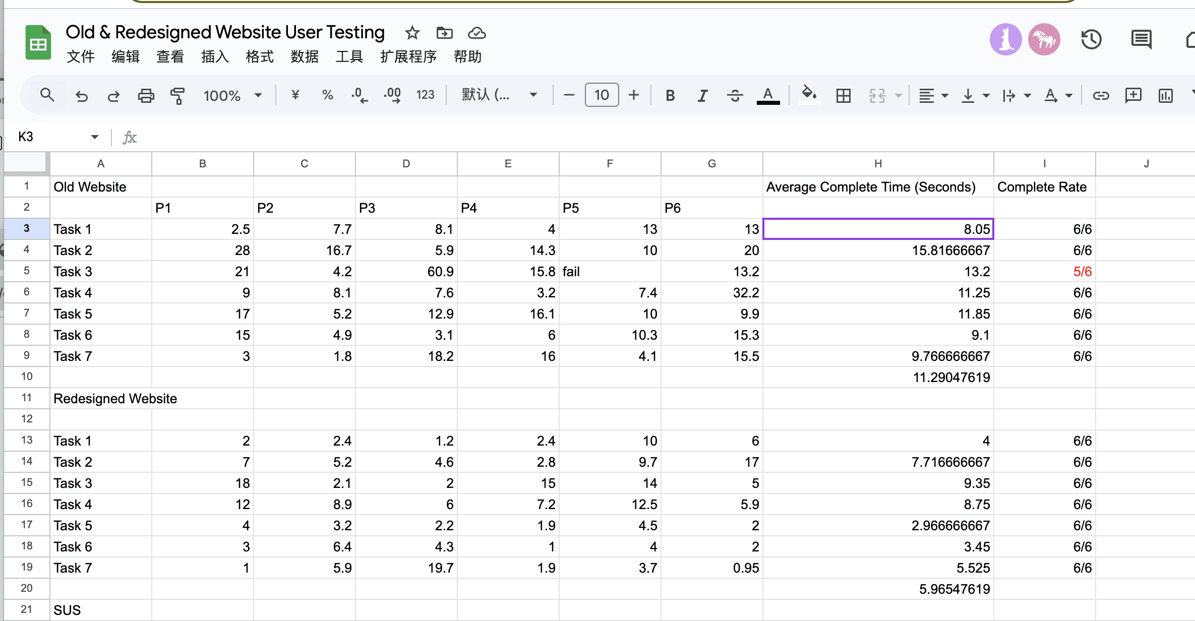
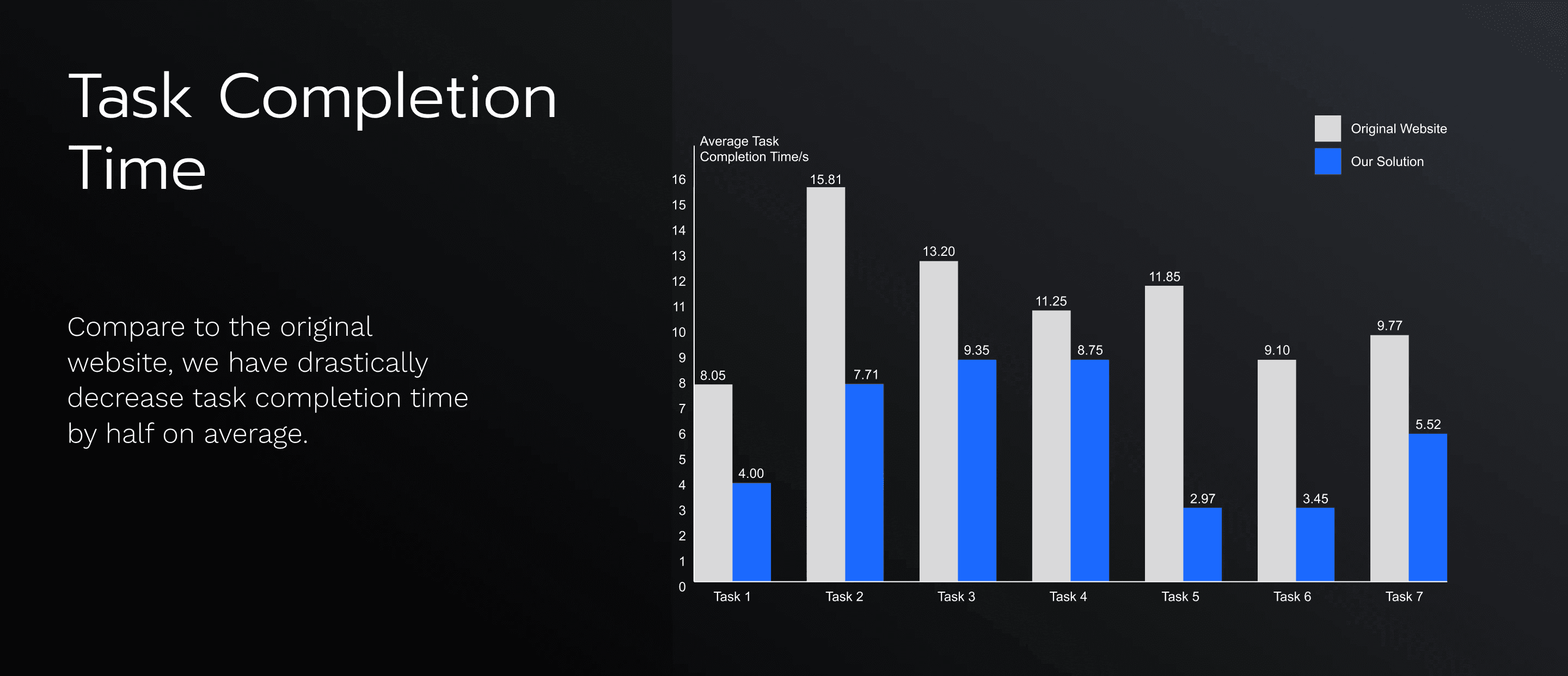
Summative Usability Testing
To assess the usability, efficiency, and user satisfaction of our redesigned Hi-Fi prototype, we did summative usability testing for the old and redesigned website and SUS.
Methodology
Technique: Qualitative usability testing Tool: Figma, Google Sheets
Participant: 6
7 Tasks
. 1.Please try to find a way to search a specific car. 2.Find the car’s features 3.Find year and MPG of the car in the filter section. 4.Sort inventory by model year, from newest to oldest 5. Find the finance option you want. 6.Find the location or hours of the dealership. 7.Contact customer support or ask a question.
Metrics:
Success rate for each task Complete time for each task
The redesigned website significantly outperforms the old design, especially in terms of speed and success rate. The data validates that improvements in navigation, filtering, and support access positively impact user experience. Overall, this redesign successfully enhances usability, with nearly a 50% reduction in task completion time.